Monday 11 June 2012

Behance

Whenever i'm on the internet I always try to keep up to date with design trends and upcoming designers.
Running my own website, Twitter page, blog, Flickr and Deviantart on top of my personal Facebook, Twitter page... has become quite a chore so adding another one to the catalogue has always been my lowest priority, until today.
I've stumbled across Behance various times in the past but i've never really sat and looked through the site with focused interest, so when I was doing just that today I was taken aback by the work of some incredible designers that I'd never even heard of before.

Here are just a few that inspired me:

http://www.behance.net/yumyumlondon

Yum Yum

 A London based duo who have created their own line of vinyl toys with accompanying animations.
Their latest animation 'Happy Food' has a level of detail, colour and texture that match those of famous animation houses such as Pixar and Aardman. The toys which are in a current high demand are both fun and original, and really do what they say on the box 'making things to make you happy'.


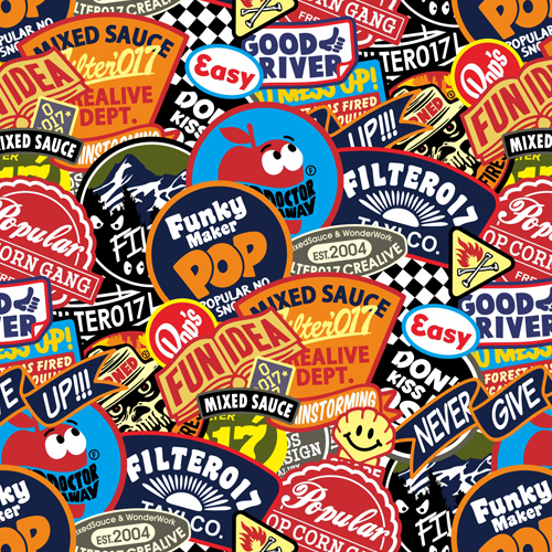
http://www.behance.net/Filter017

Filter017

A Design team based in Asia who create and sell their own unique designs based on American and Asian culture. These guys really appealed to everything I love about design, similar to that of 'tokidoki' (another greatly admired design company of mine) they've created their own style and made it into a brand, selling t-shirts, journals, stickers, posters.. all sorts of different ever expanding product lines.
The style is a clean modernized take on American typographic art and logo art, all brought together in fun explosions of image text and colour that compliment each other beautifully like a well thought out collage.
They adhere to some of today's biggest brands that also utilize a similar style such as Superdry and Hollister but really make it their own and make it better. I was especially impressed with their embossed product's as the level of detail is incredible and the finish is really unique.

I could talk about them all day but I'll let their work speak for themselves


New Project!


It might be our summer break but there's no rest for the creative. For the past few days i've been working on a favour for a friend who has an upcoming book called 'After He Died'.
The book is roughly about 2 teenage boys that die under horrific circumstances and find each other in a sort of 'afterlife' which is made up of infinite cities.

There are a lot of elements to the story, but most of all its a love story so I wanted to use this as the focus for the cover artwork as well as including this endless horizon of cityscapes that make up the setting for the book.

I drew a lot of my inspiration from 1920's movie posters such as those for 'Metropolis' where cities are also a big focus, and are made up of simple geometrical outlines combined with distinctive grainy shading, that comes off as quite strong but beautiful.


I influenced my own style and bright colour palette in the production of the artwork, and gave the piece more detail by digitally painting in a sun set. The cities where outlined from photographs of famous cities such as Sydney, San Francisco and New York, then placed together to give the feeling of enormity as the book describes them as being infinite.

To finish off the piece I chose a font that complimented the geometric outlines of the cities as well as keeping it classic and modern.


Thursday 31 May 2012

Final Logo and Homepage Fun!

So, after much developing I decided to go with something simple and personal so I went with a really great typeface and just made a few personal changes before setting it in my favourite shade of red which I think is quite a timeless colour especially in design.


I wanted to transform my homepage/portal into something interactive to draw people in. Because my main focus at the moment is self branding and creating an image for myself, I'm continuing with the 50's American theme and drew inspiration from a few different areas. I started by illustrating the signs stood outside a lit up diner at night but I decided the diner was too bulky for the front page and was a little distracting from the navigation, so I took some of the elements and made a small desert scene, still using the signs as navigation, but making them more of the centerpiece than a backdrop.


I think the overall effect looks great, especially as an opening image. It still needs developing a bit more and I'm thinking of adding more interactive features in the near future, but for now I'm going to focus on creating a twitter page and mobile site.

Stay Tuned!

Sunday 27 May 2012

Logos - Initial Development

So, following some quick research on 50's diner logos, I gave a shot at my own using my own name as the base. I started by sketching a basic logo and began to replicate the same one in illustrator but making small changes each time til I came up with a whole variety like this:


Saturday 26 May 2012

Self-Marketing/Logo Development

So as a little summer project i've decided to 'brand' myself, make a logo and style that I can apply to things like my CV, portfolio... Obviously, since this is a visual representation of myself, I'm taking the things that inspire me the most and will be applying them to my designs.

Because I have such a huge HUGE passion for American culture, I've started looking at places like classic American diners where the designs are strong and unique so use them as influence for my own logo, style...

Here's a few examples of great Diner logo's i've been looking too for inspiration:


The typefaces are usually a mix of handwritten signature type font mixed with a bold straight edged retro font which is a really nice look that i'll be looking to adopt in my logo. Colour wise, these are quite a mix but i'll be looking to classic American colours for my palette.